Looking at data is an ongoing series of software experiments to investigate poetic and playful approaches to working with code and using code/data to produce images, animations, tools … .
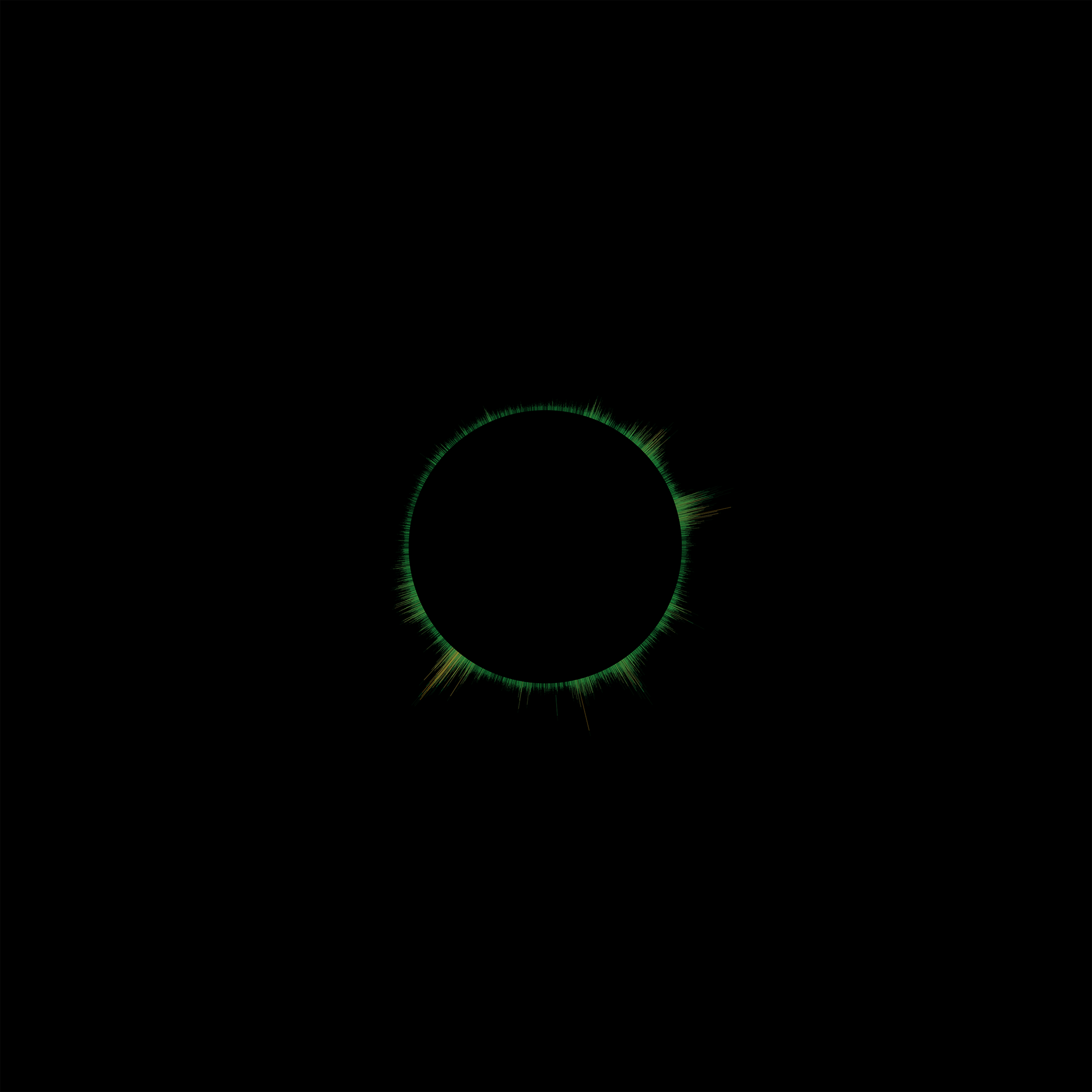
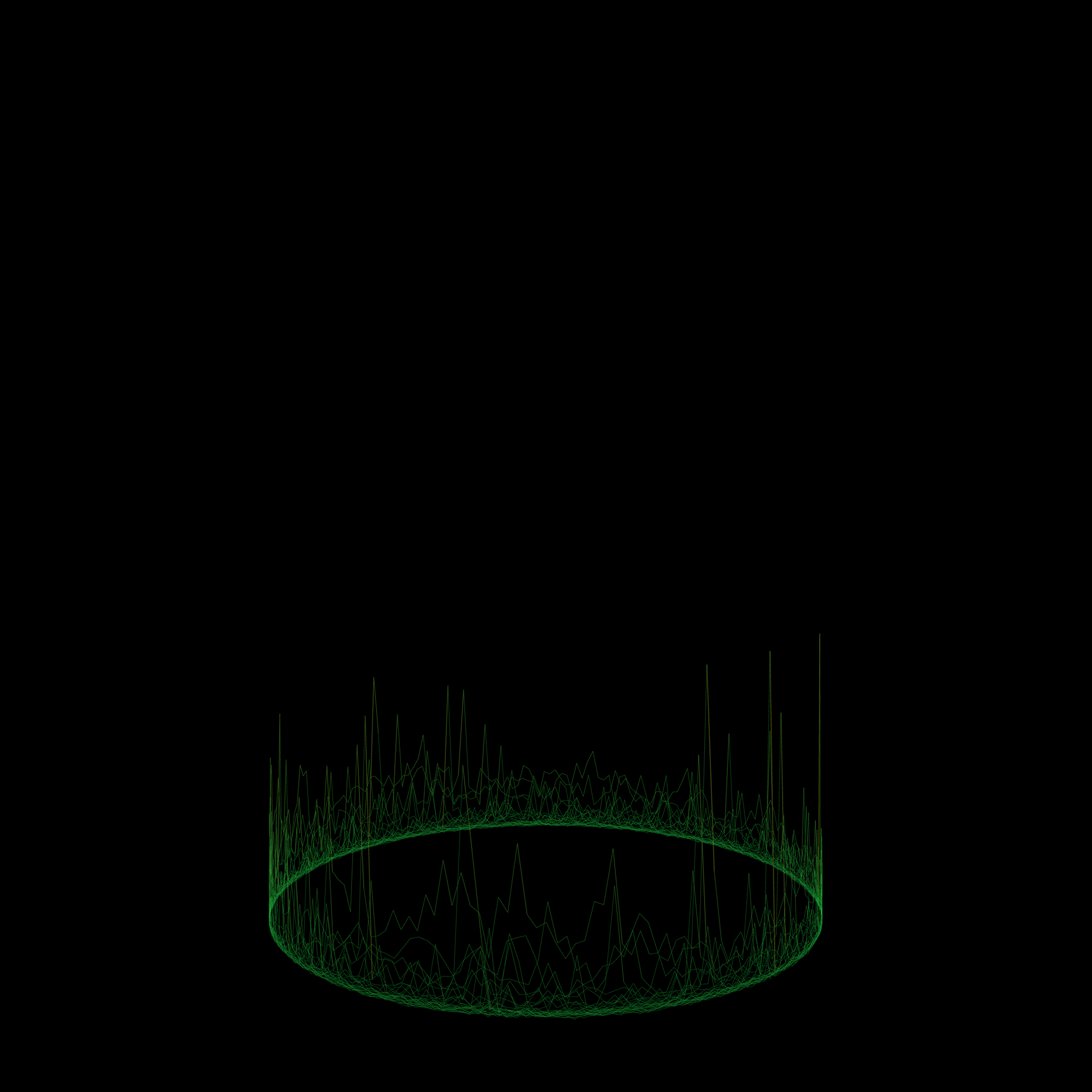
Sound data of places
Sound data of a geographic location measured over a set period of time is mapped around a circle. Over time a specific sound pattern for each place emerges.
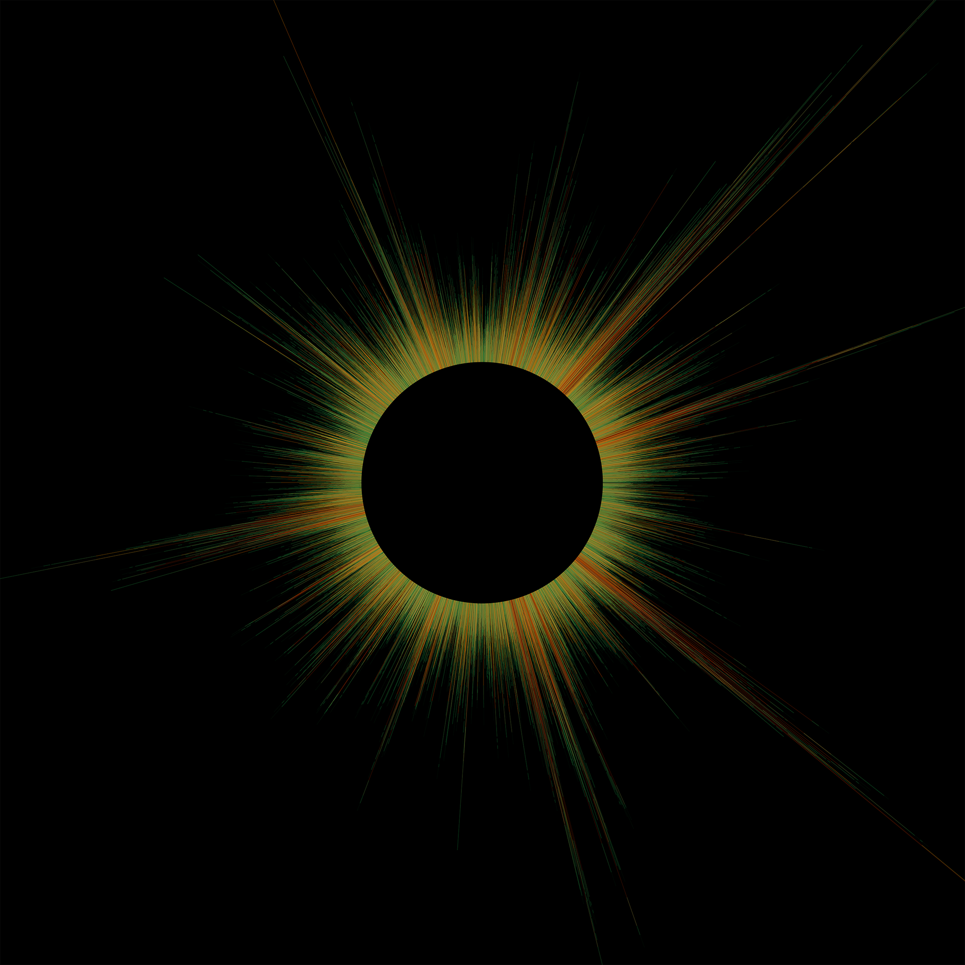
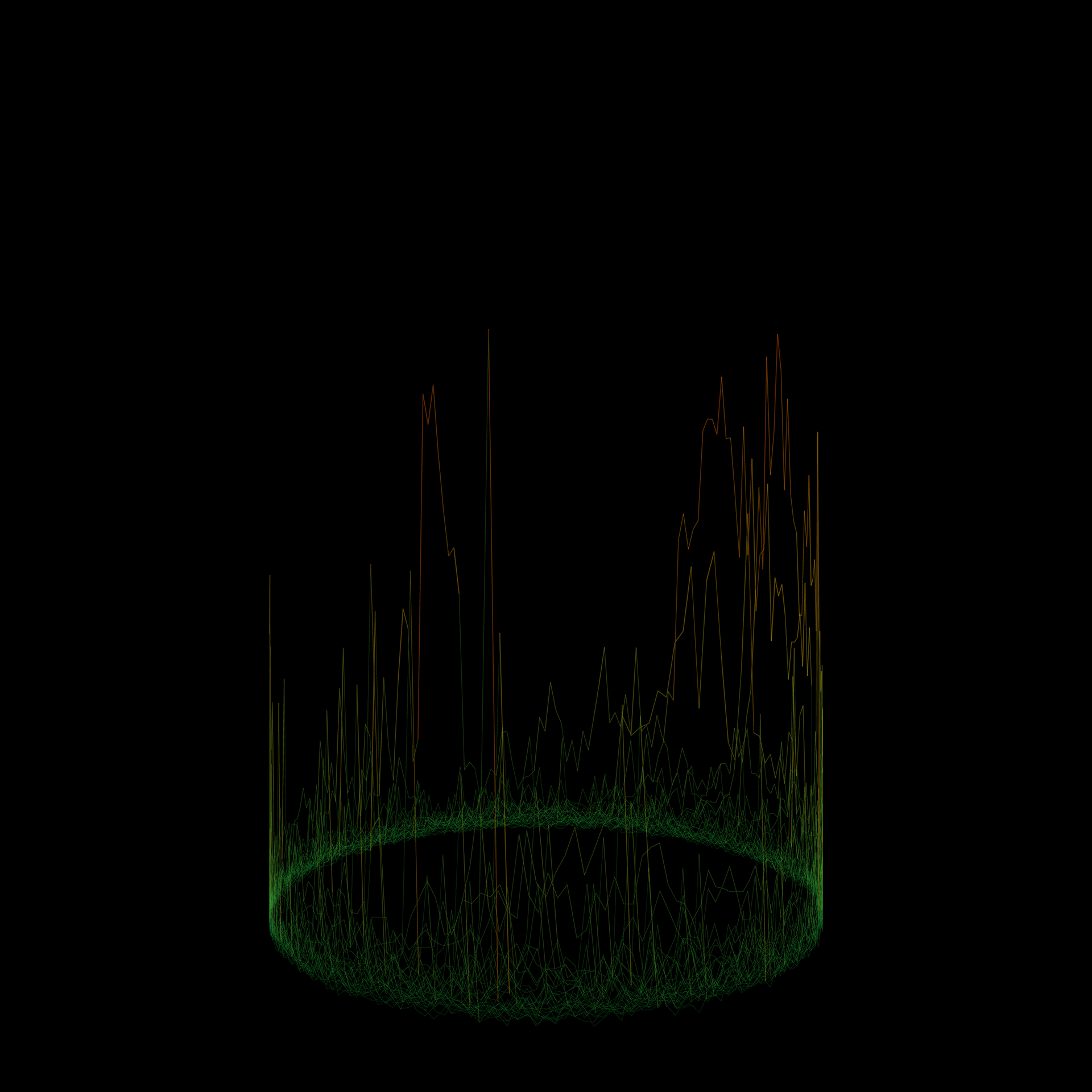
Time lapse animation:
30 Minutes of data from four different places compressed to 30 seconds
Films as rhythms of colours
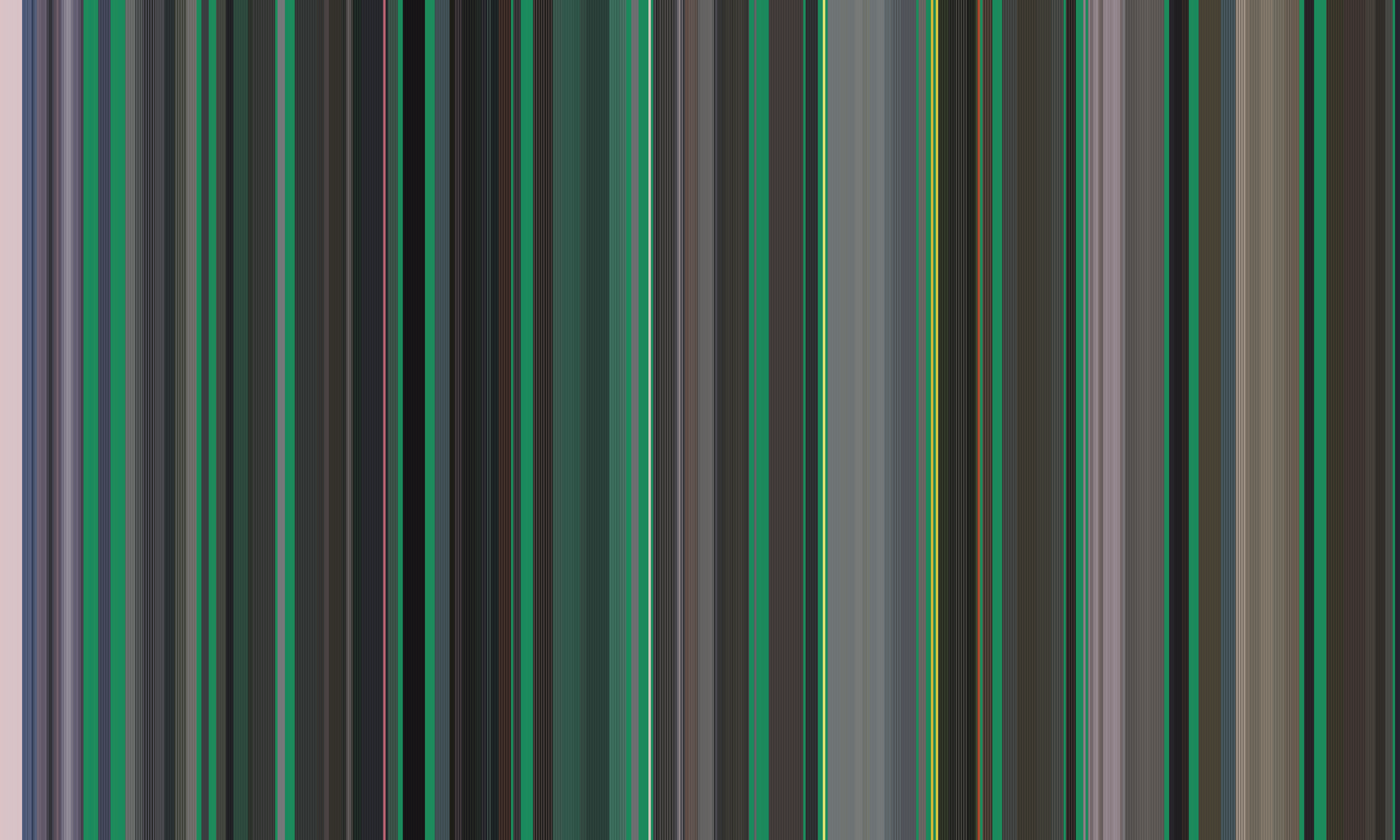
Images of films are subtracted at a set time frequency. Each of these images is divided into segments. The average colour of each segment is calculated. These colours are then visualised as a pattern of vertical lines, either in accordance with the chronological progression of the film or according to different colour values.


The colours of war (two frontlines)
The colours of hundreds of images of the horrific Russian invasion of Ukraine where gathered from online news and social media. These images where divided into two groups, each representing another kind of frontline: 1) The battlefield, 2) The political front (meetings of politicians, press conferences). Afterwards the colours of these two groups of images where subtracted and ordered to different criteria.

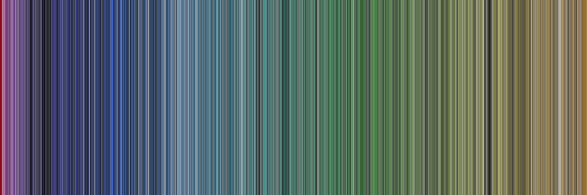
Colours ordered by hue (top: battlefield, bottom: political front)
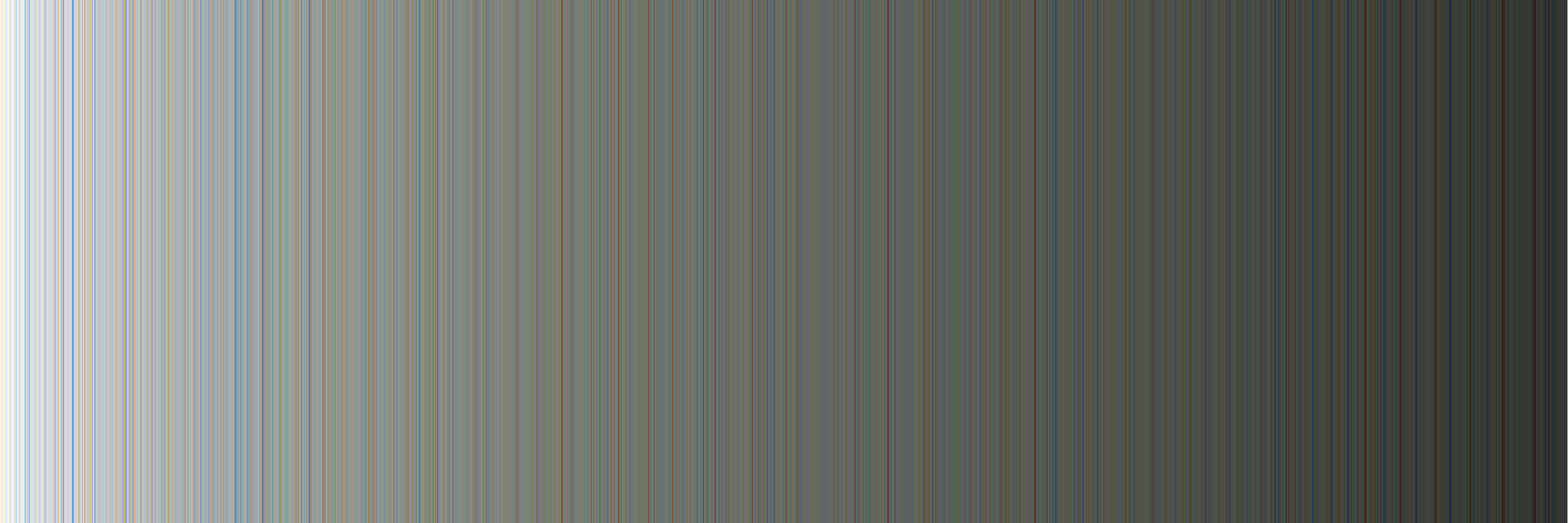
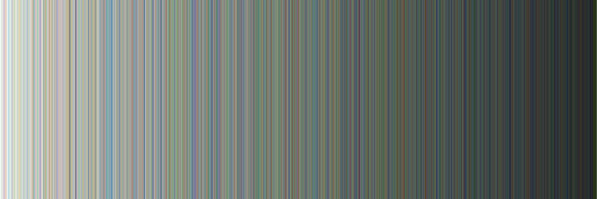
Colours ordered from light to dark (top: battlefield, bottom: political front)
Typographic animations
Image rain
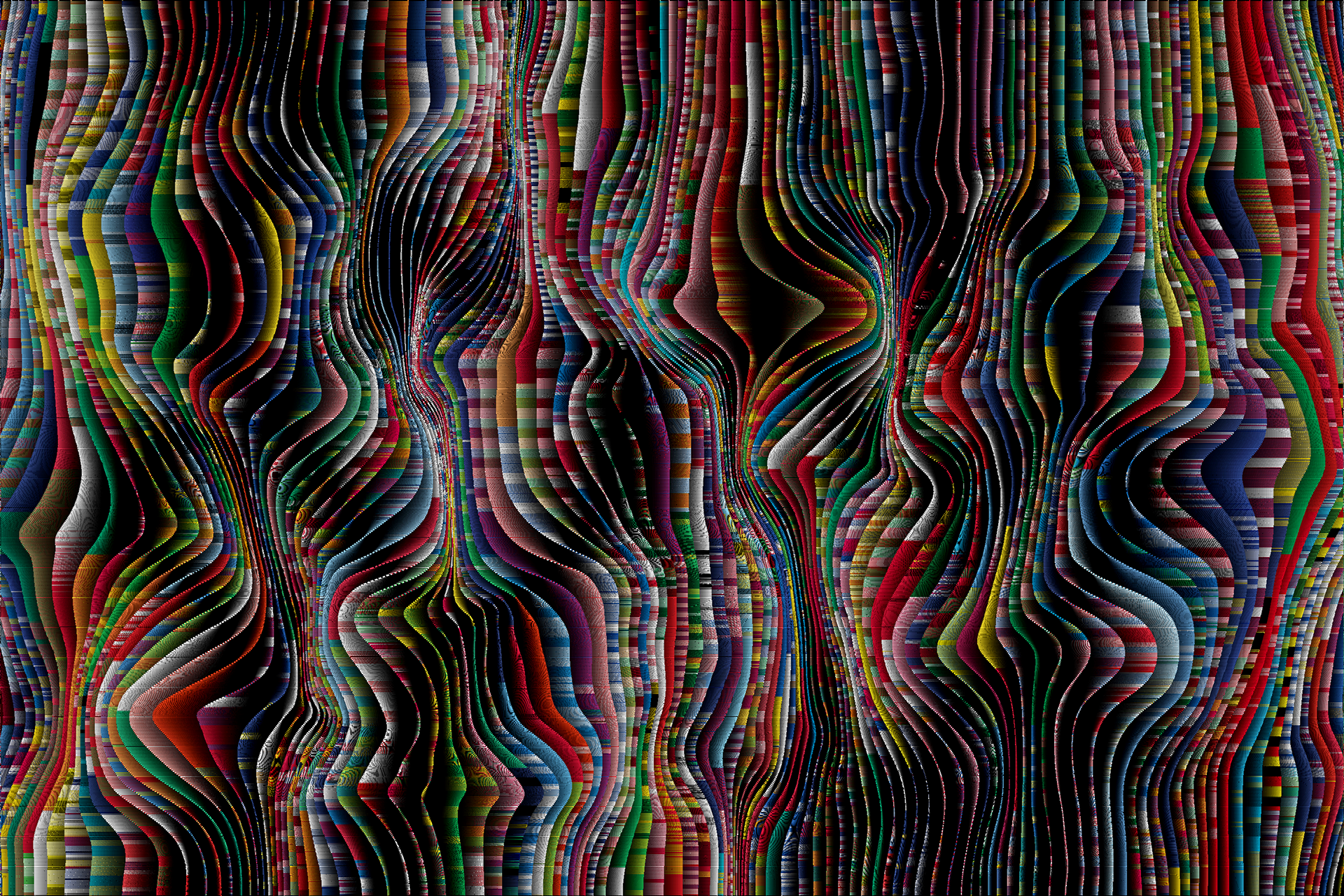
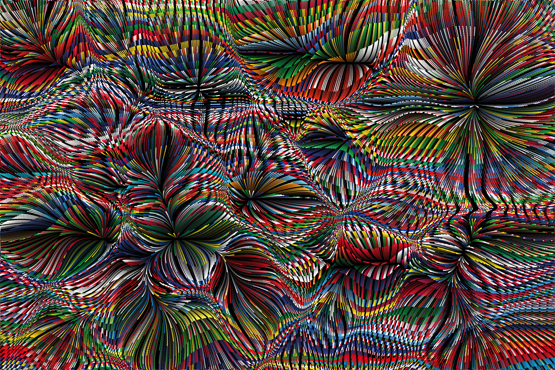
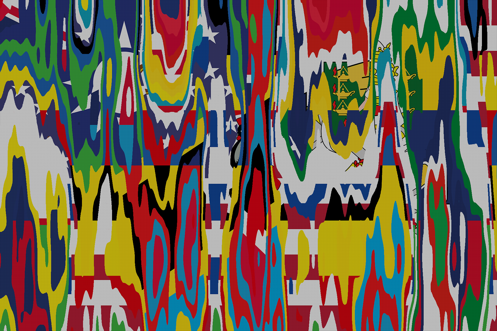
The flag files
An algorithm subtracts the colours of a data set containing all the images of the national flags of the world. The resulting colour array is then combined with algorithms usually used to create artificial landscapes in films or computer games and with algorithms used to visualise physical forces.