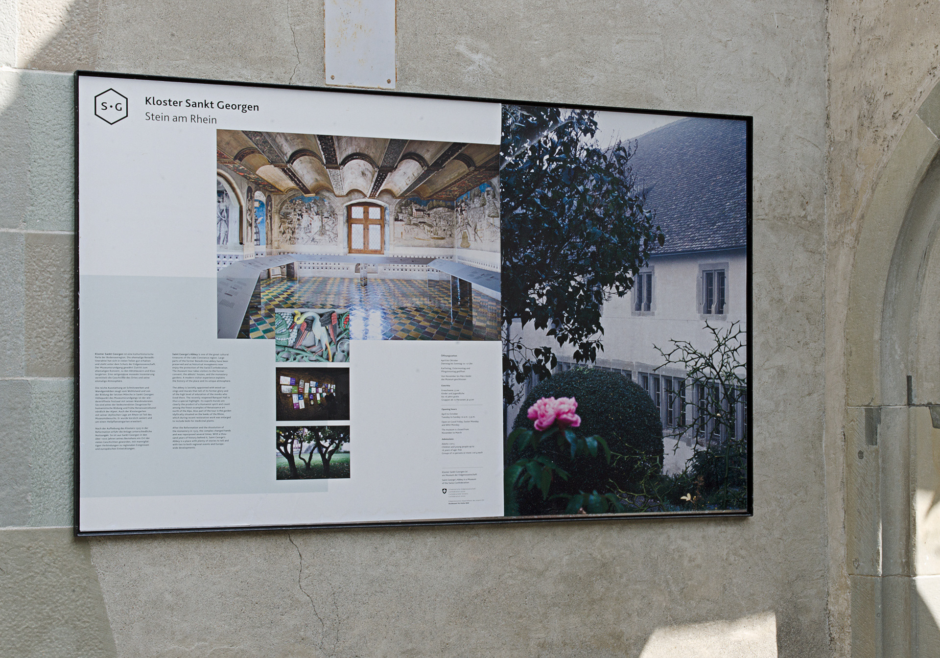
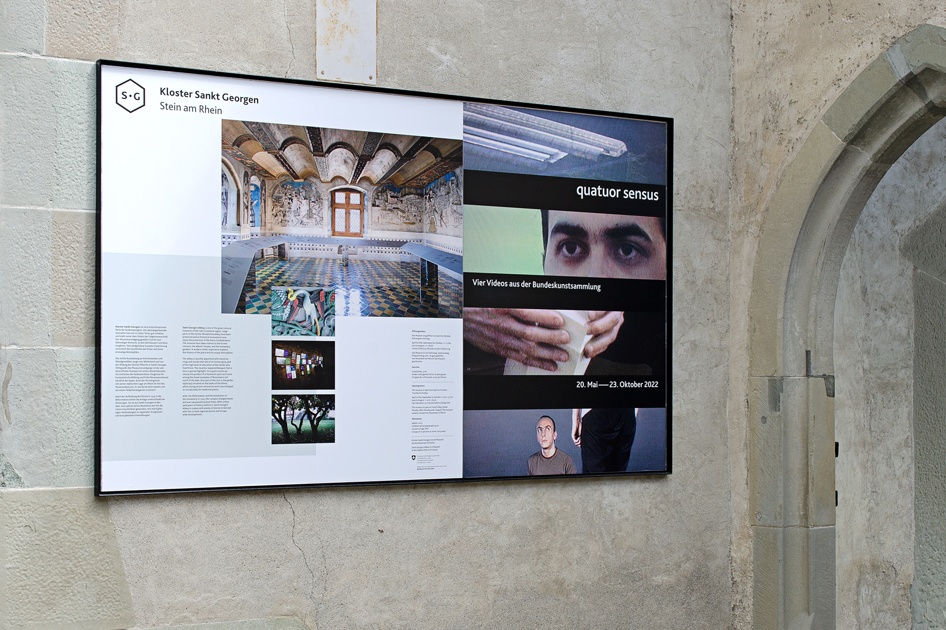
Saint George’s Abbey is a heritage site located in Stein am Rhein at the confluence of the Lake Constance and the river Rhine. Protected by the Swiss Confederation the former Benedictine abbey is excellently preserved and features outstanding cultural treasures.
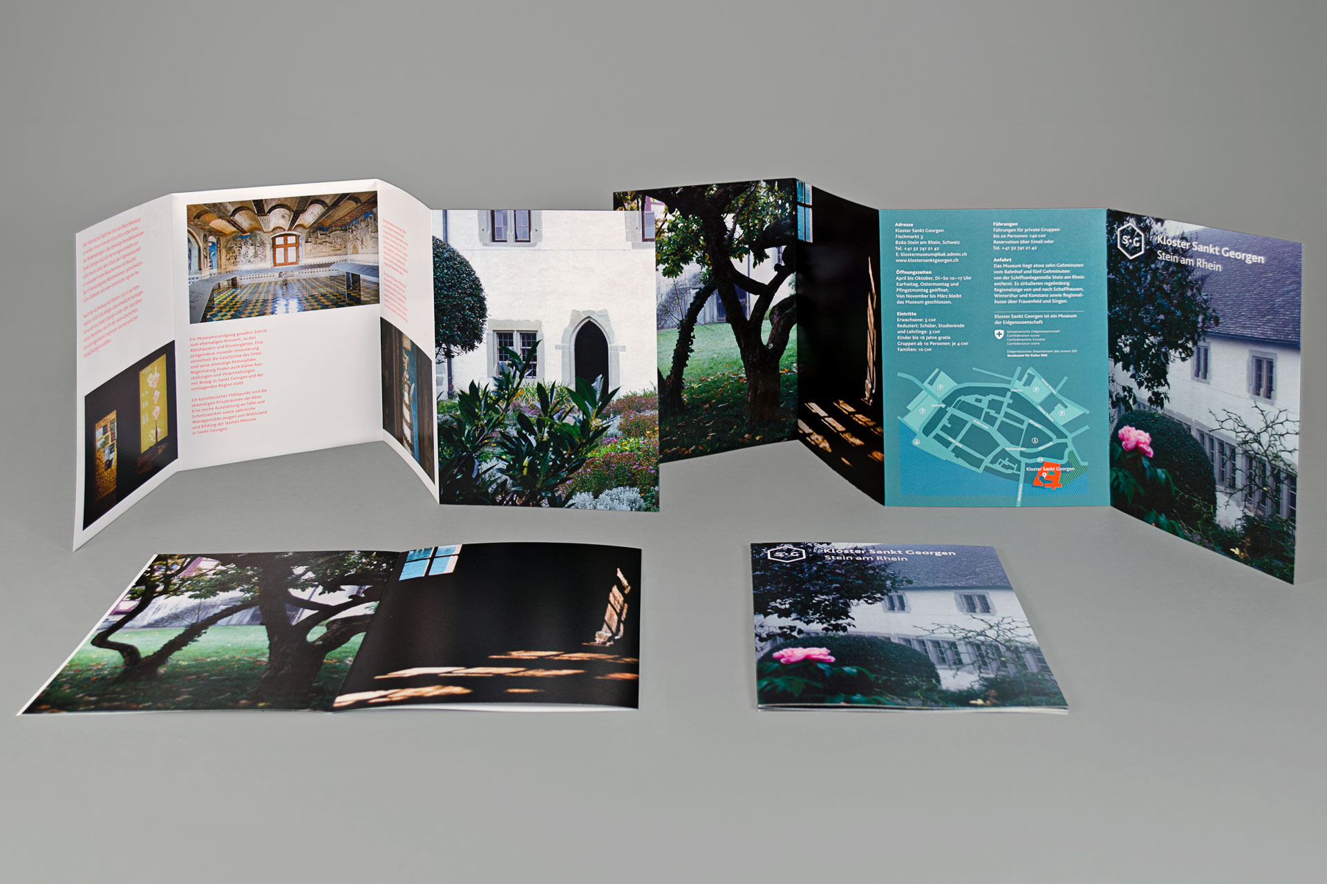
After the dissolution of the monastery in 1525, the site changed hands and was repurposed several times: For example it was used as the residence of the bailiff of Zurich, as a school, for harvesting silk or as the regional library and museum. With a thousand years of history behind it, Saint George’s Abbey has become a place where plenty of stories happened, with ties to both regional events and europewide developments.
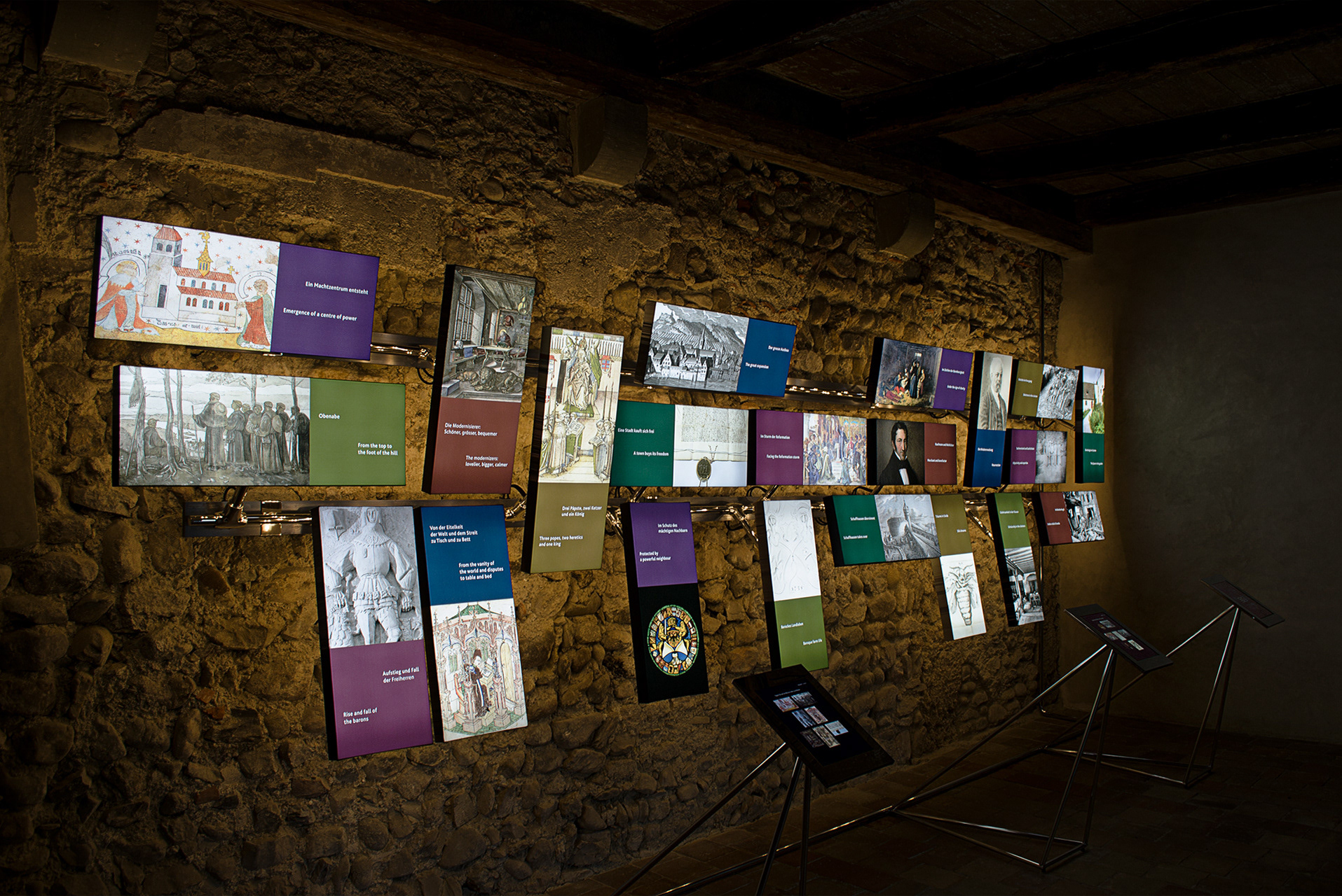
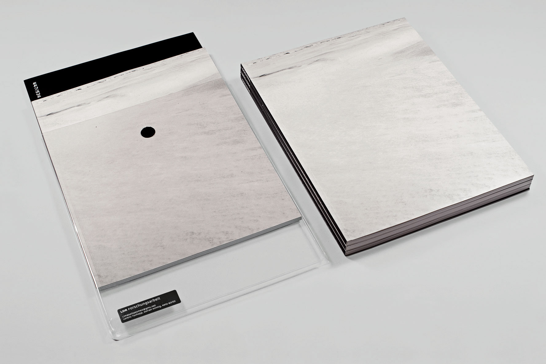
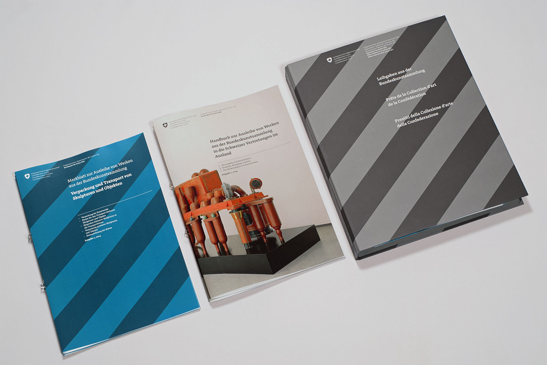
As part of an upvaluation of the site Studio Lorenz Tschopp was given task to develop the visual identity, signage, publications and the graphic- and information design for a new permanent exhibition.
As part of an upvaluation of the site Studio Lorenz Tschopp was given task to develop the visual identity, signage, publications and the graphic- and information design for a new permanent exhibition.
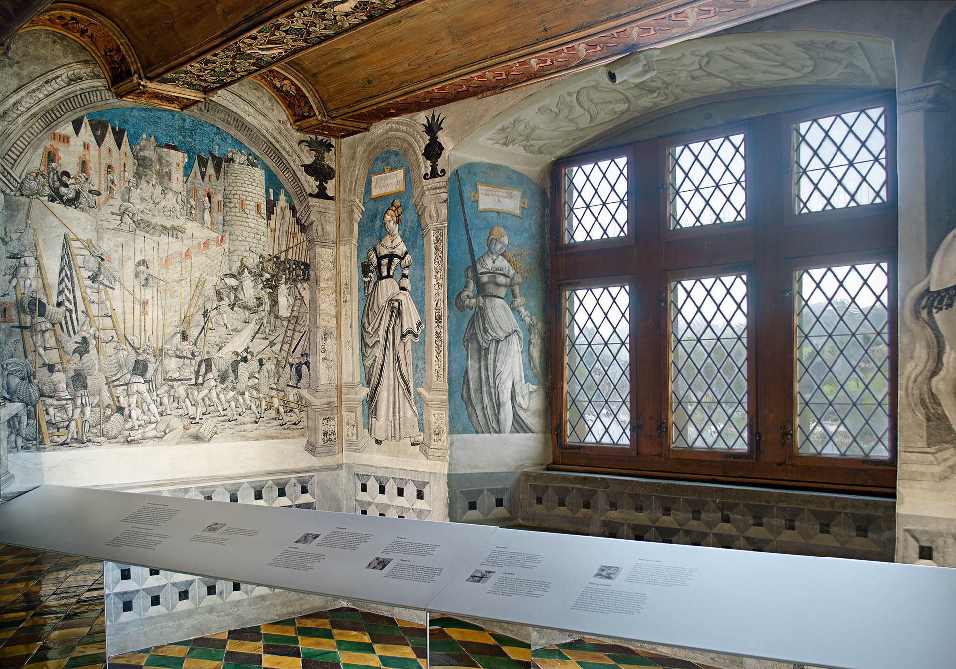
The Banquet Hall and its early Renaissance murals are considered to be unique north of the Alps.
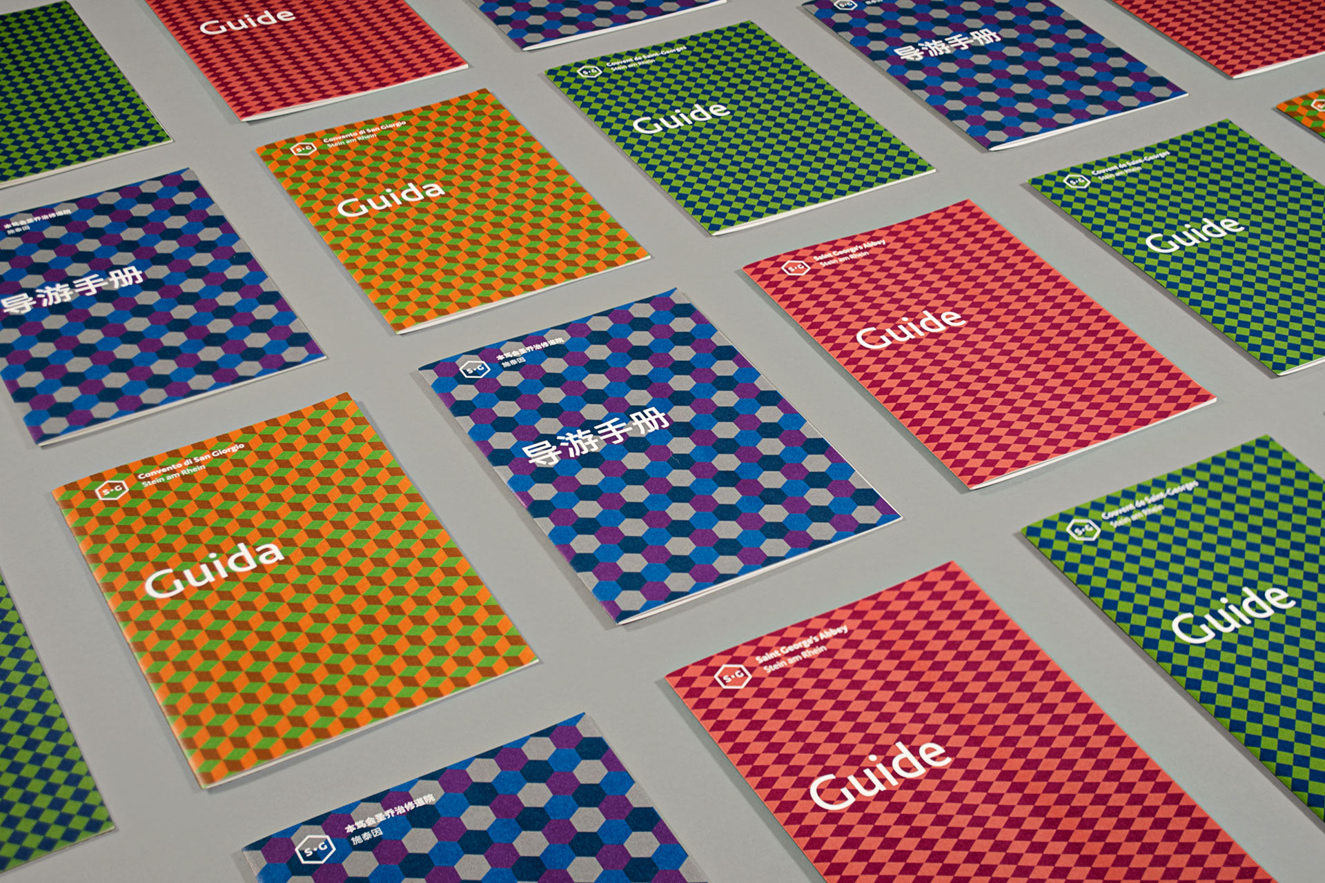
A challenge for the design of the visual identity was to represent a place with such a distinctive architecture and at the same time conveying the idea of a place that over the course of time experienced multiple usages. Since many tourists visit the site, the visual identity has to be multilingual.
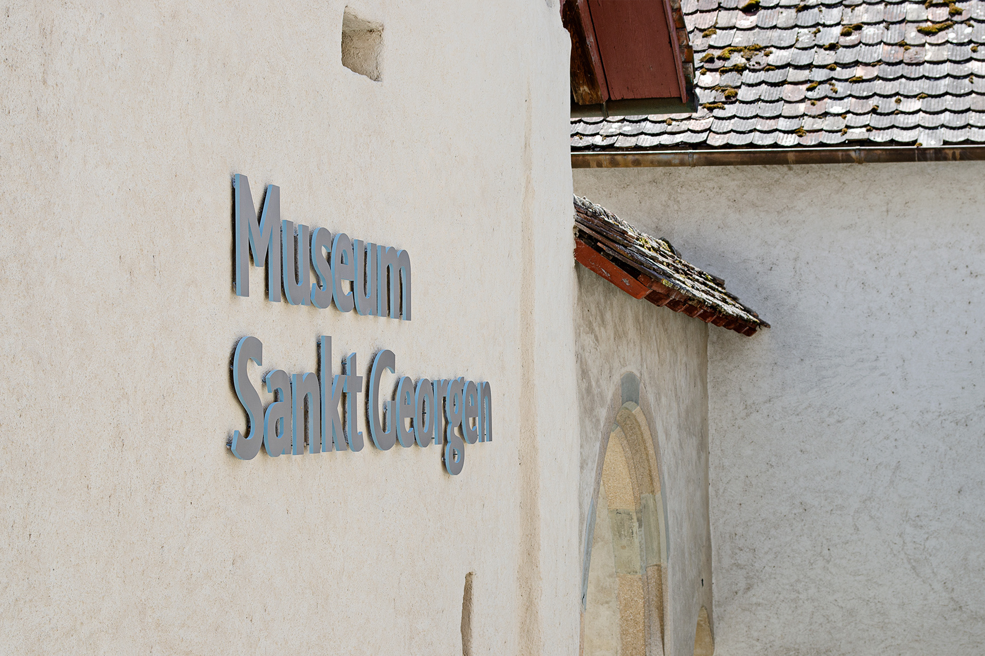
The concept of the logotype is based on two elements: A signet and a word mark. The outline of the signet is the outline of an isometric cube. It loosely references some distinct architectural features of Saint George’s Abbey. At the same time the isometric cube is a generic representation of space. The letters SG are the initials for Sankt Georgen in the four different languages German, French, Italien and English.
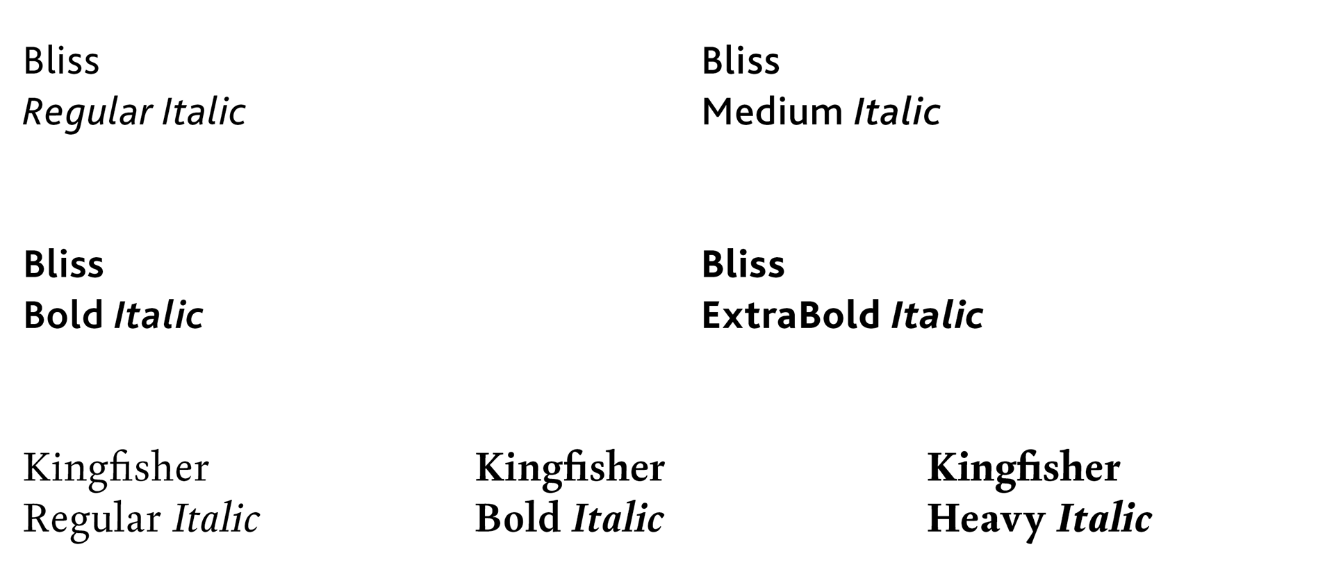
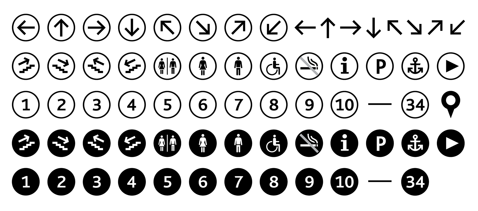
The visual identity consists of a graphic toolbox and an image library. The typeface Bliss, designed by Jeremy Tankard, serves as the primary typeface for all communication.

Photography
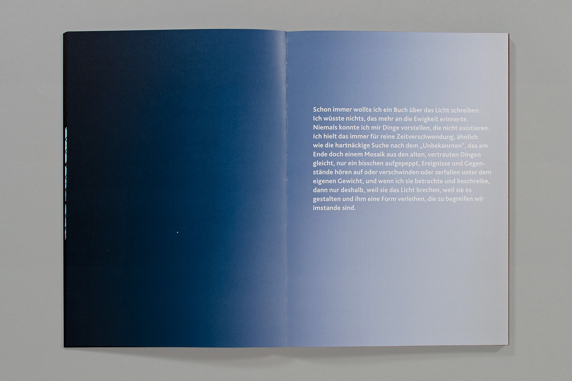
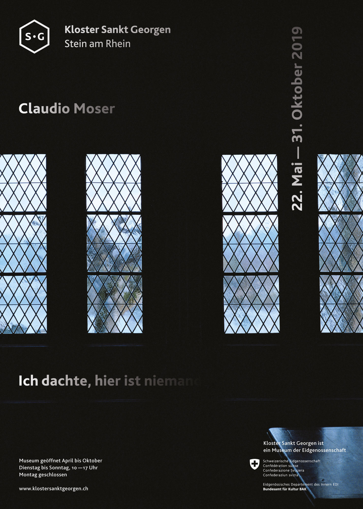
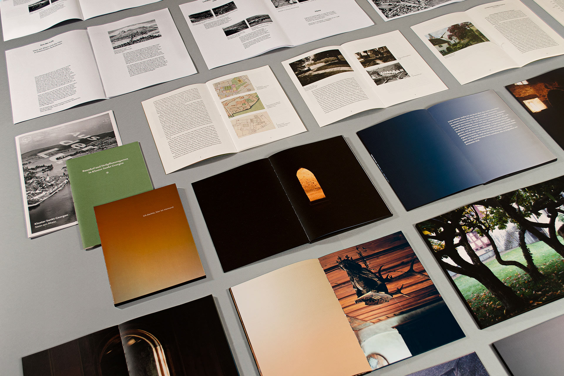
To complement the images of the artworks (wall paintings and carvings) images from different photographers where commissioned. Among them Geneva based artist Claudio Moser. Over the course of one year, he photographed the abbey through his own artistic lens, producing one series per season. The resulting images were used for the abbey’s communications and were also presented in an exhibition on site. There, they entered into dialogue with the architecture, extending the longstanding interplay between art and architecture that has characterised the place since its early history. The exhibition was further accompanied by an artist’s book conceived by Claudio Moser and Lorenz Tschopp.
Alltogether these images are thought of to be part of the communication, the progamming and of the activities of the museum: collecting, exhibiting and mediating.
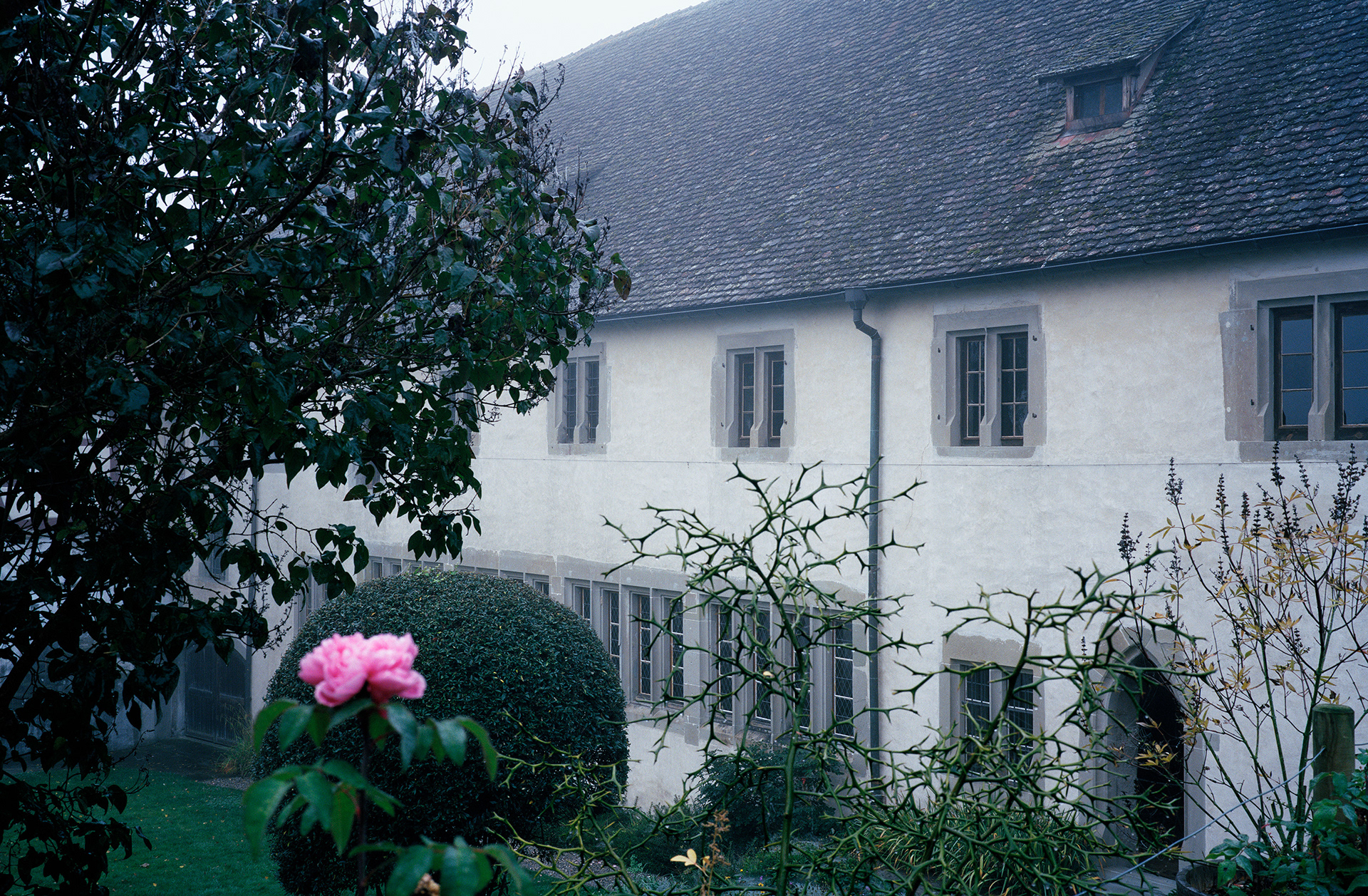
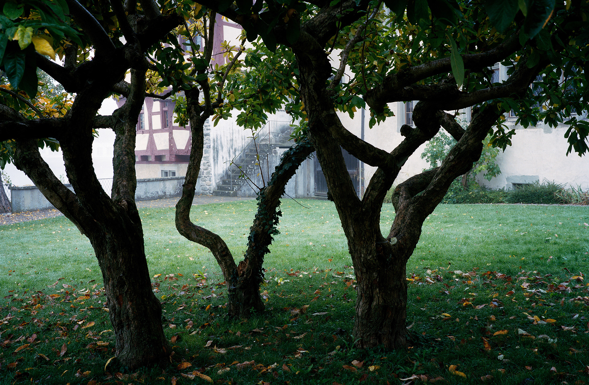
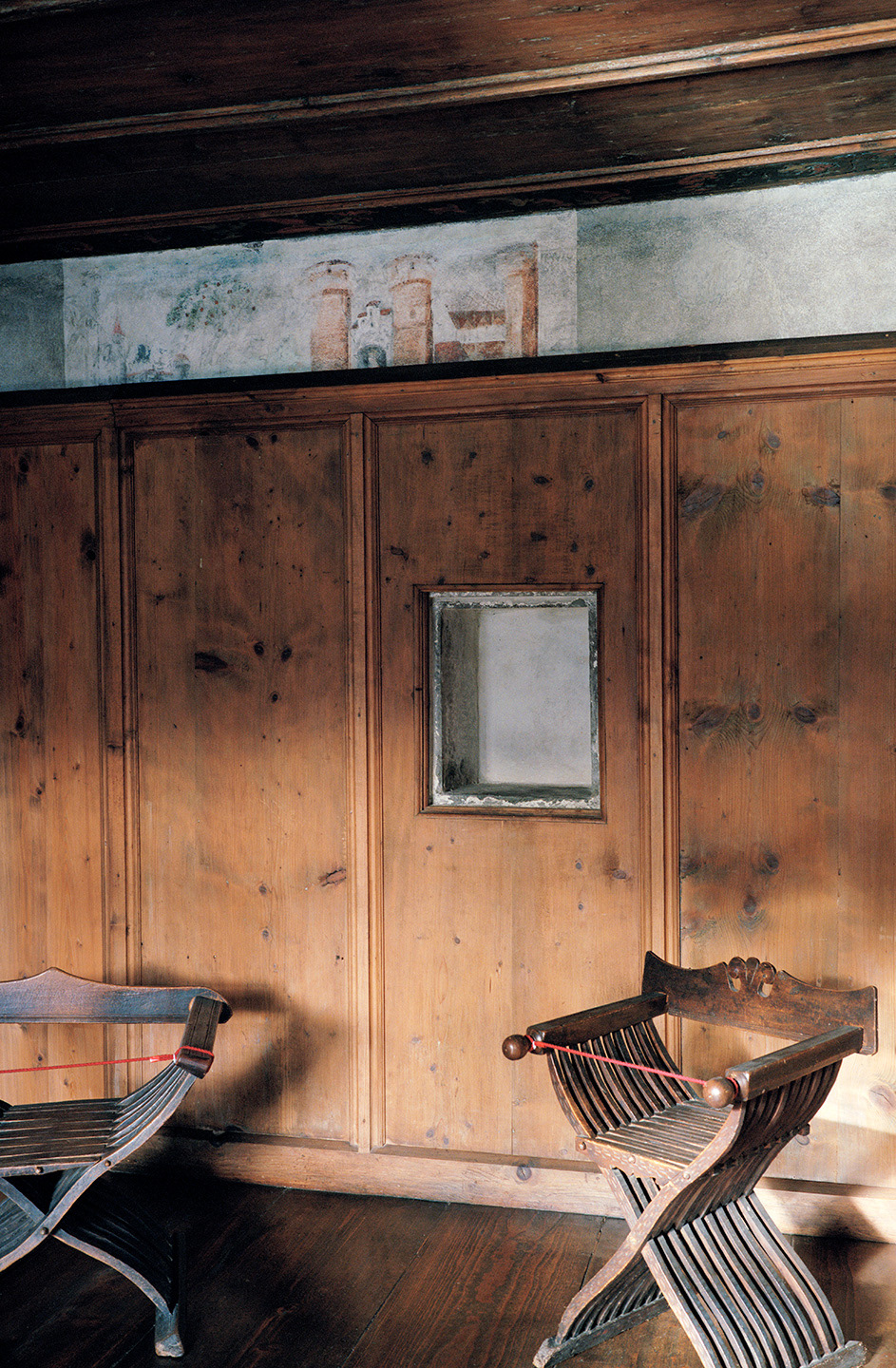
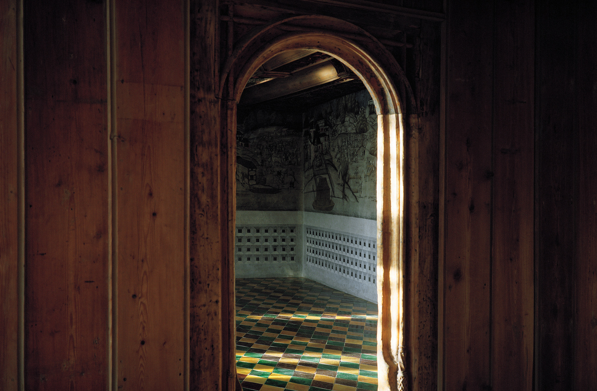
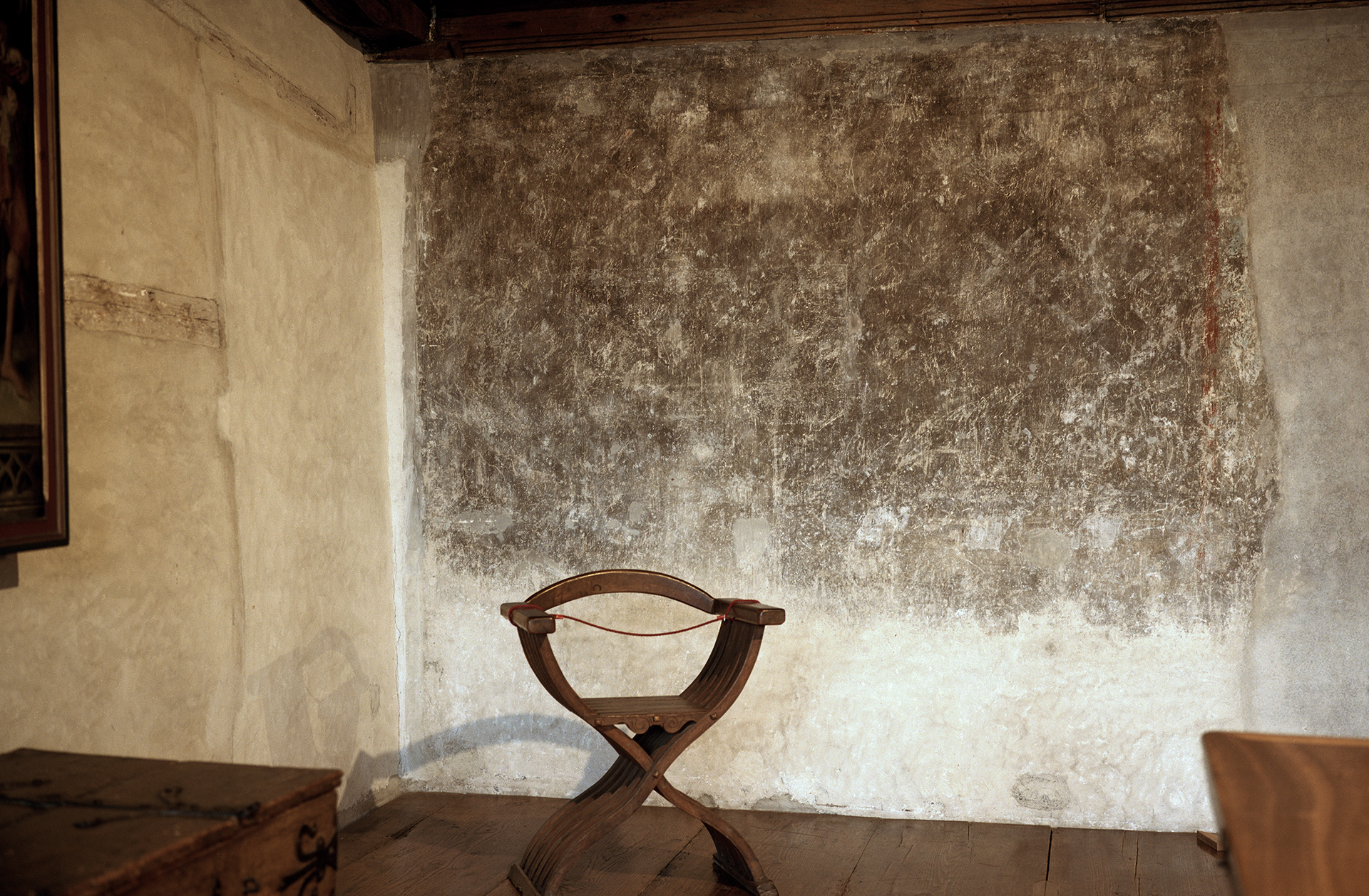
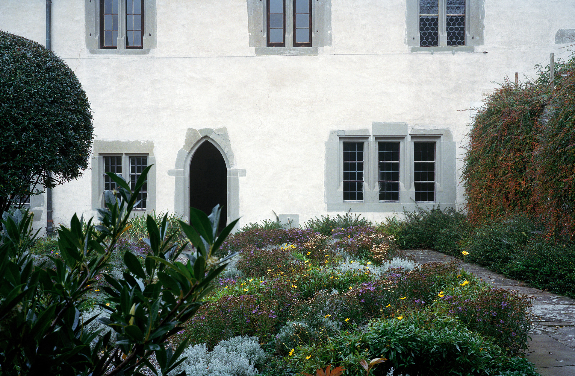
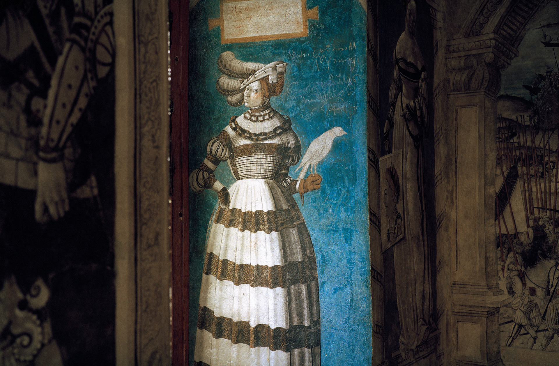
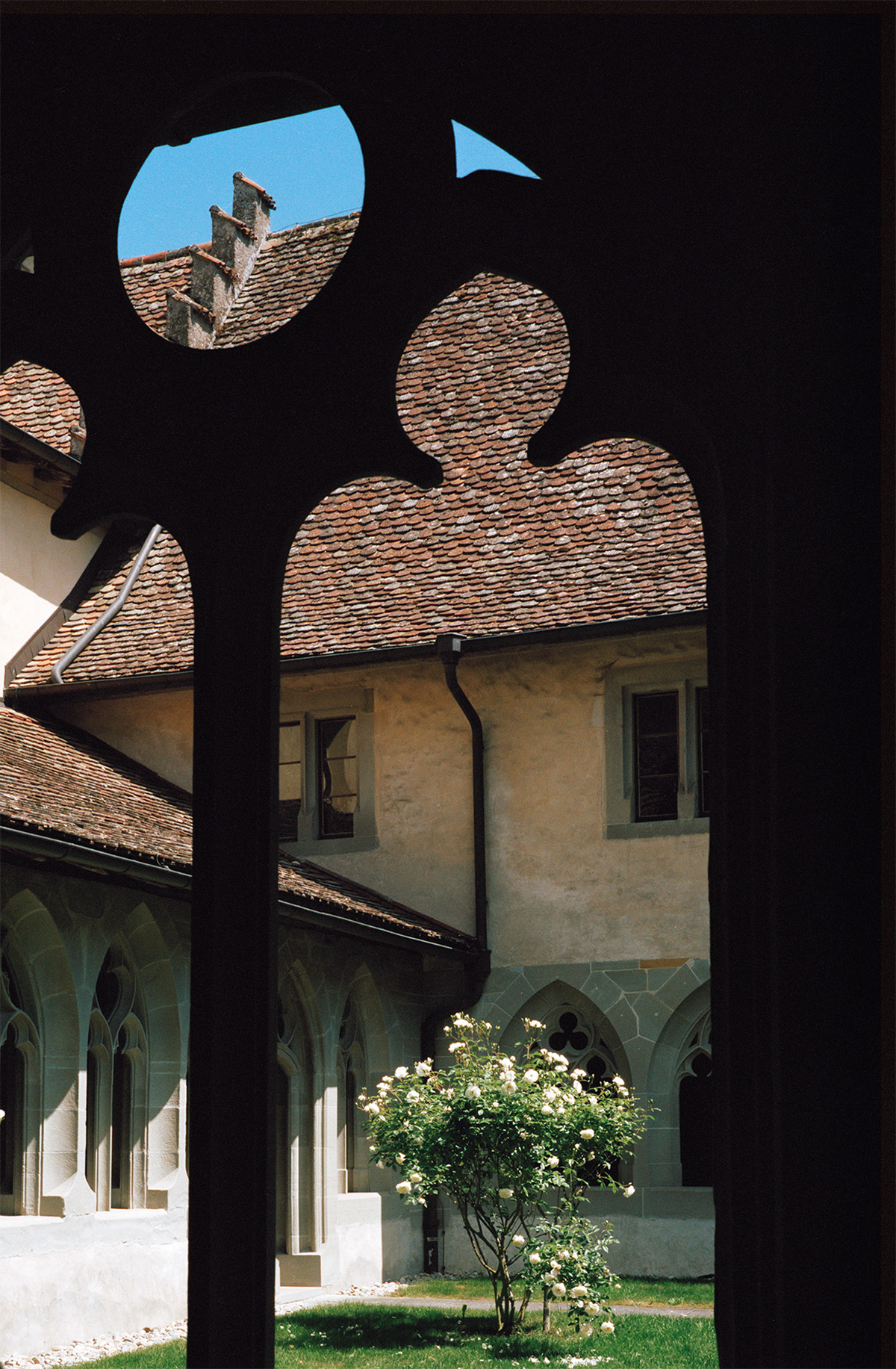
Photography: Claudio Moser
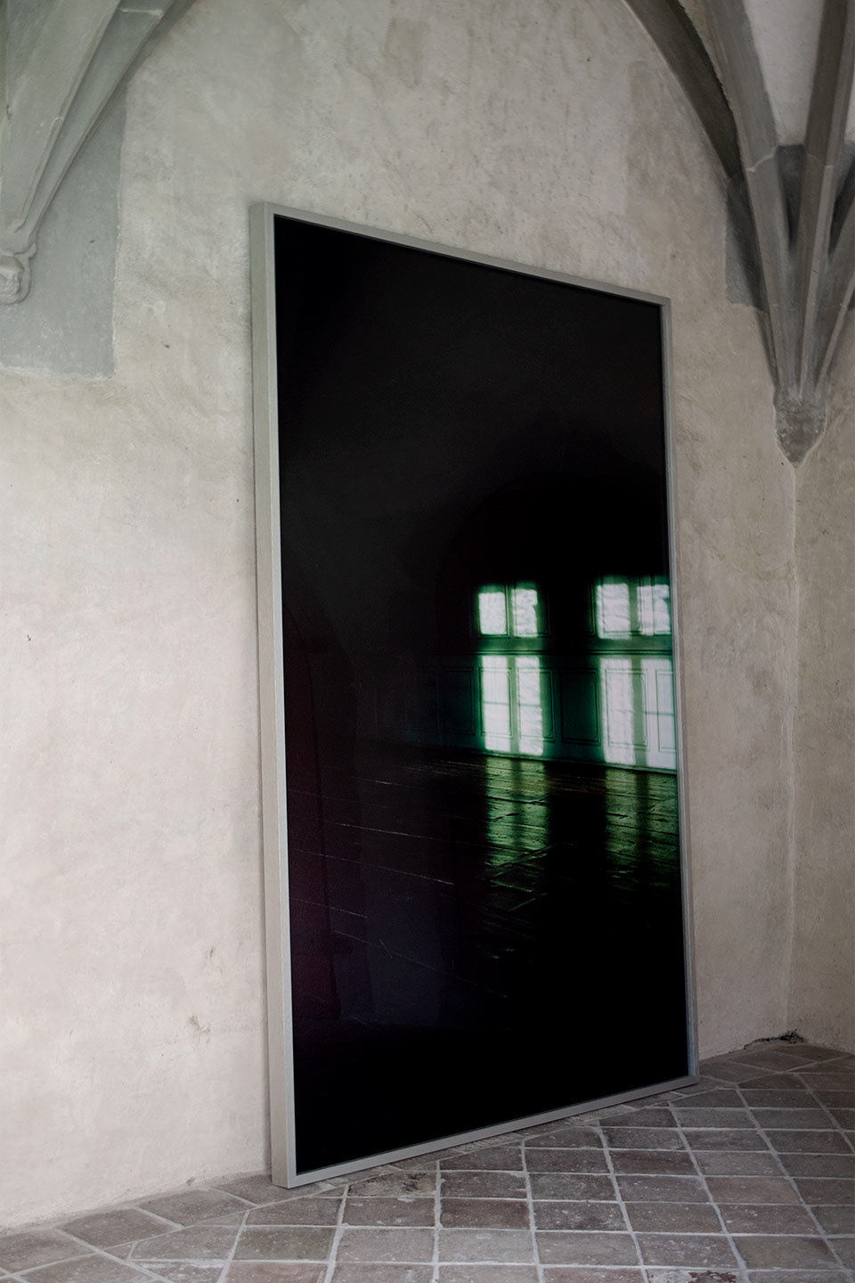
Photography by Claudio Moser exhibited in Saint George’s Abbey
Applications
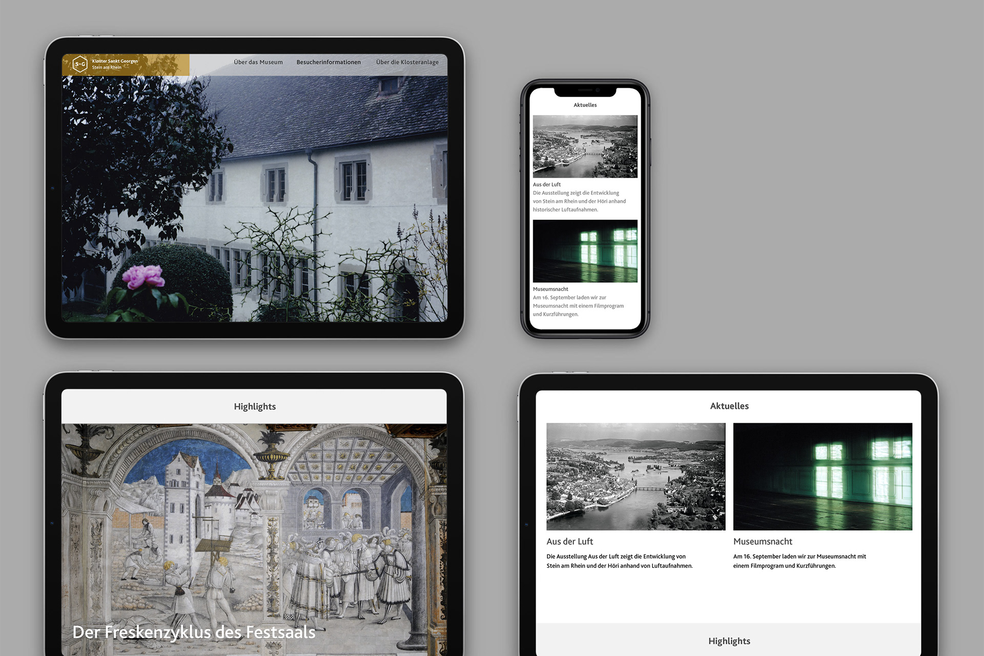
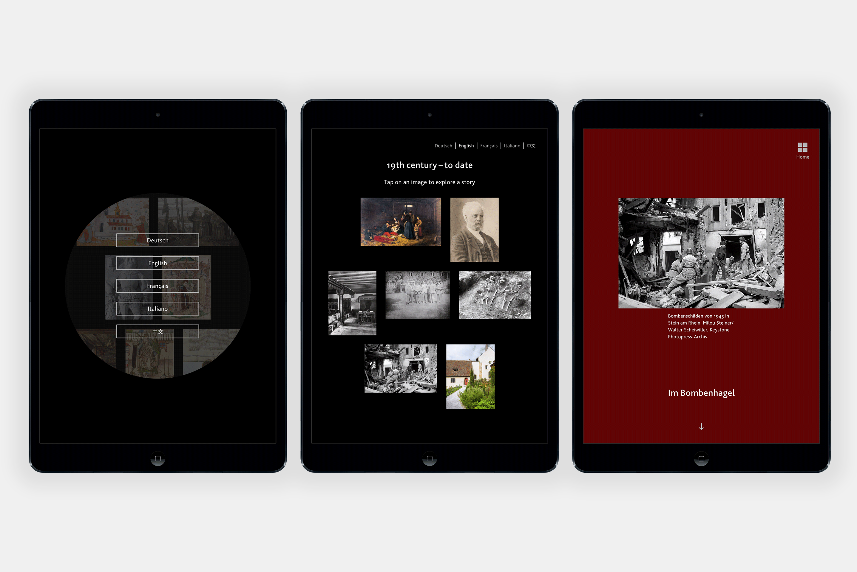
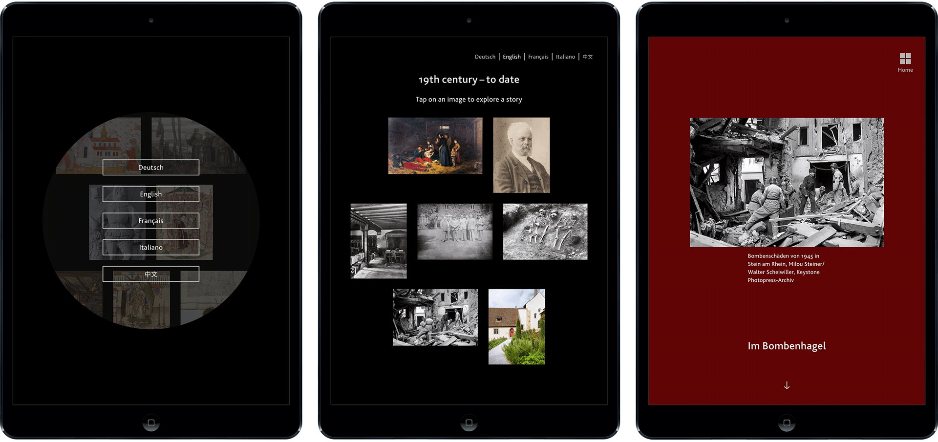
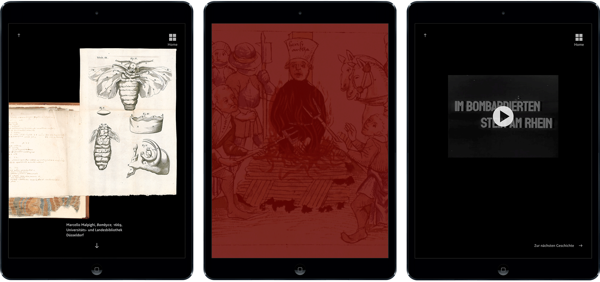
Website (visualisation, not realised)
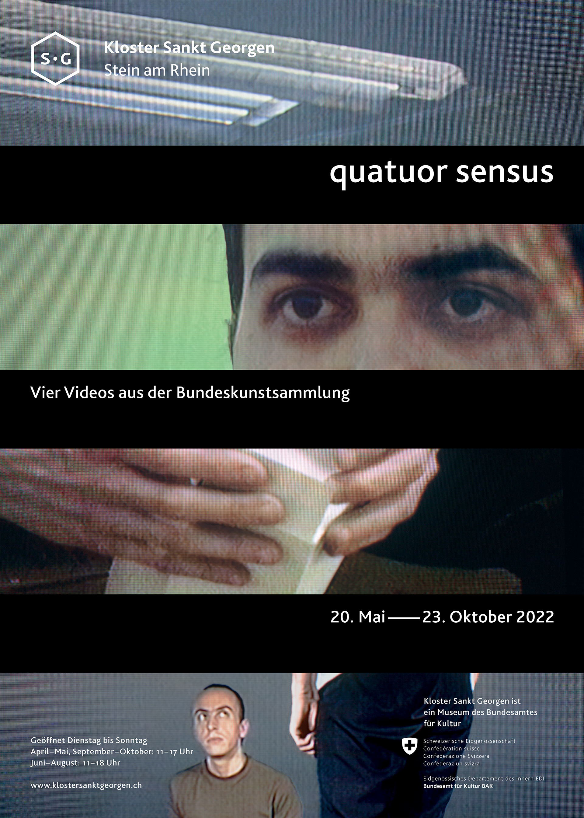
Motion graphics


The exterior signage for the garden is floor lying on blocks of locally sourced sandstone
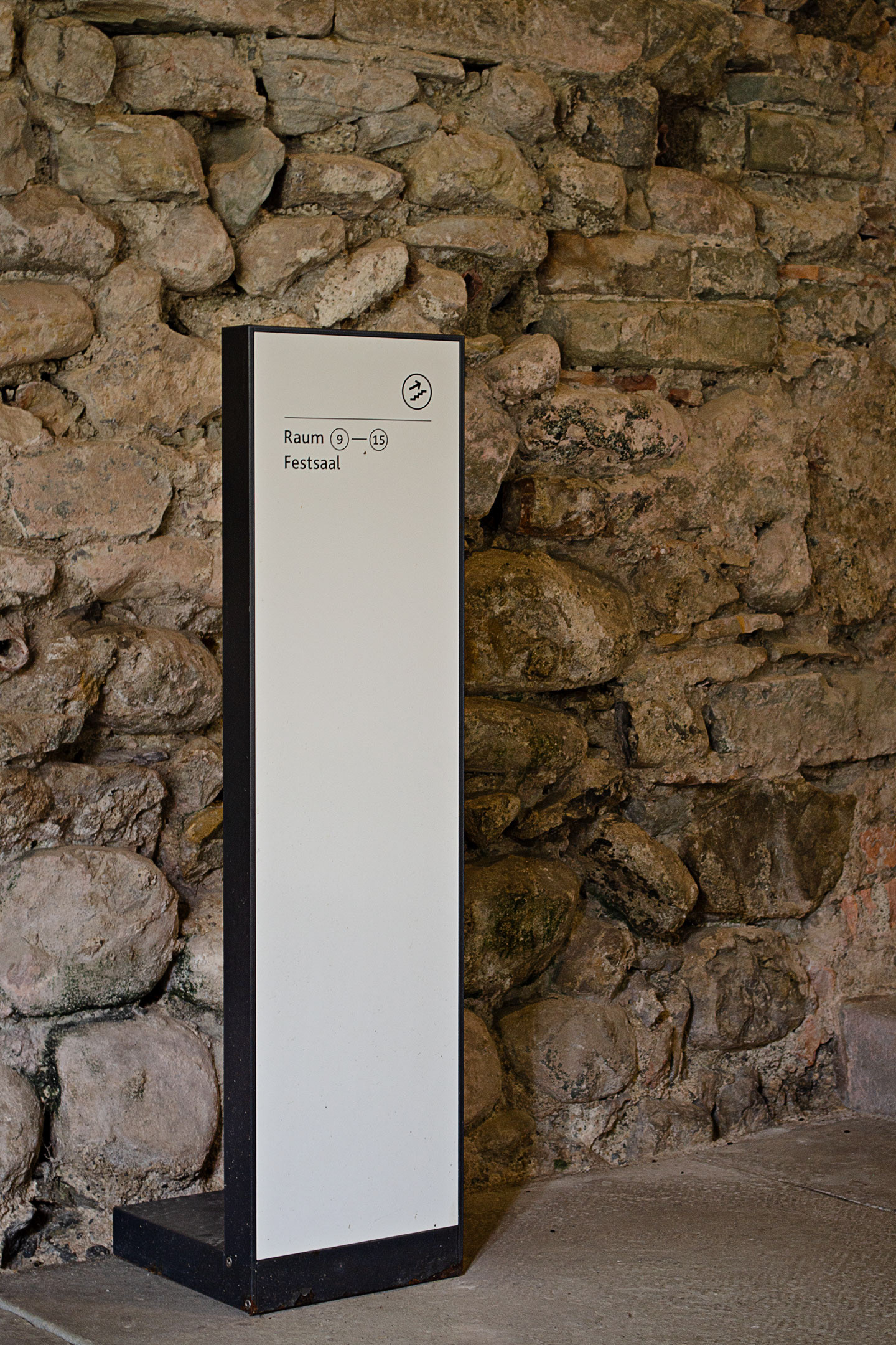
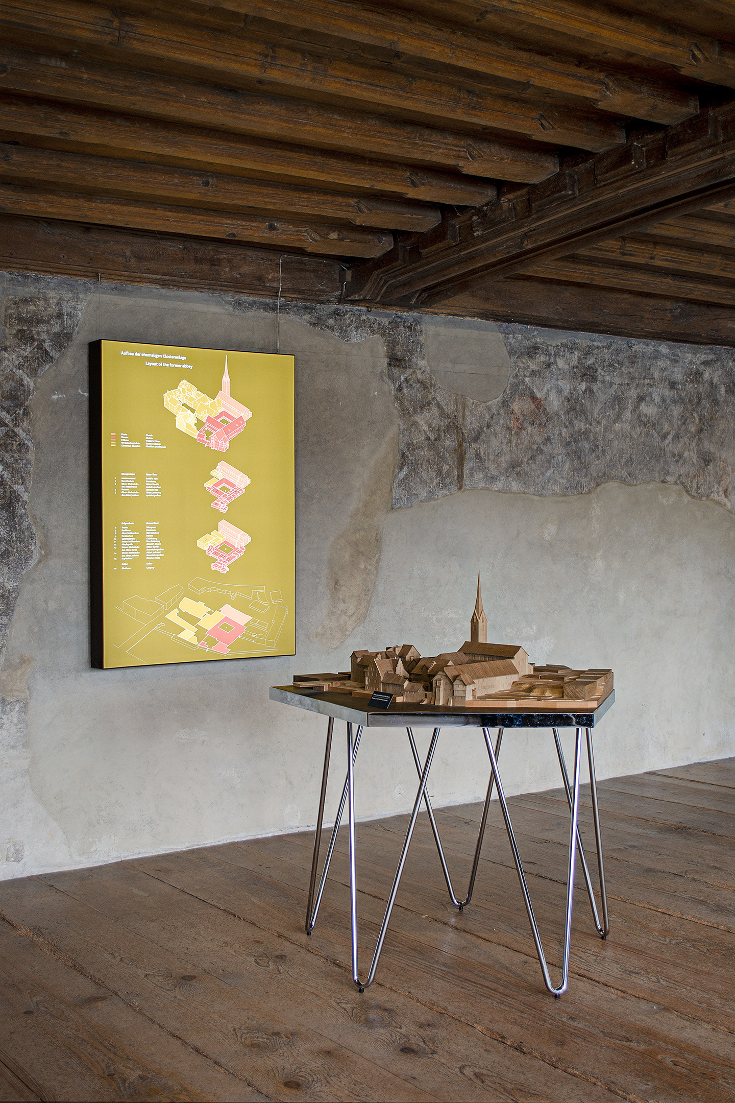
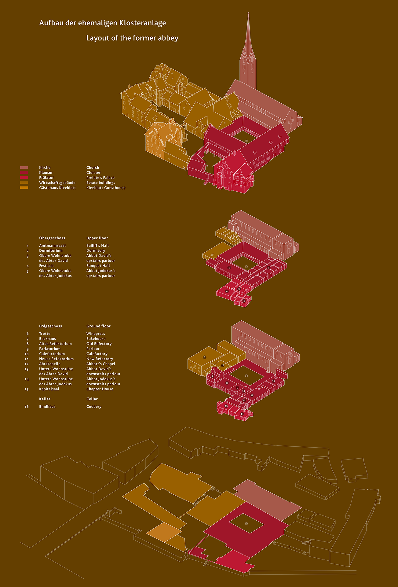
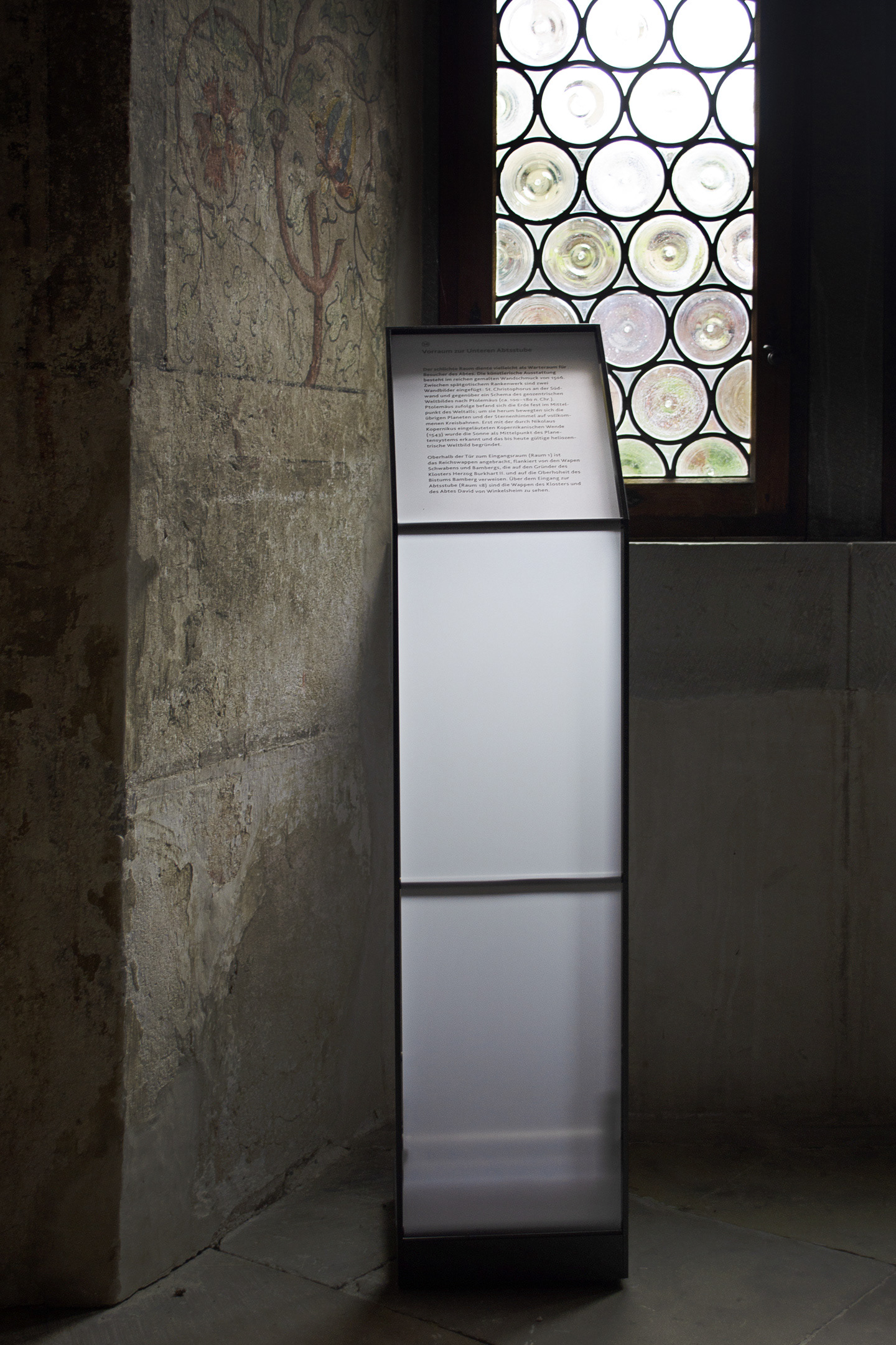
For the interior wayfinding and the room texts the already existing signage (originally designed by Les Ateliers du Nord) was reskinned.
Client
Estate of the Gottfried Keller Stiftung
Scope of work
Concept and design visual identity
Design of various implementations
Signage
Editorial design
Exhibition graphics
Motion graphics
User interface design
Design of various implementations
Signage
Editorial design
Exhibition graphics
Motion graphics
User interface design
Project partners
Scenography permanent exhibition: Holzer Kobler Architekturen
Photography: Claudio Moser, Patrik Fuchs, Sascha Geiser
Photography: Claudio Moser, Patrik Fuchs, Sascha Geiser